
Loan Application Journey- Efficient, Faster and Reliable
Designed a digital Auto Journey that reduced application time by 50% by eliminating manual back-and-forth.

How it started
Right now, getting a loan means lots of back-and-forth with an Expert Loan Consultant-sharing details, uploading docs, waiting for checks, and sometimes redoing it all. It’s a bit of a manual maze!
We’re flipping the script: users will fill out info and upload documents themselves, and voilà-the app zooms straight to the Bank WIP stage automatically. Smooth, simple, and totally DIY!
Team
1 UI and UX Designer, 1 PM,1 APM, 1 Developer
Project Duration
2 Months
My Role
UI Designer, UX Designer, Researcher, Team Collaborator
Project Credit
Gyandhan
Project Overview
The education loan journey today feels like a manual obstacle course—constant back-and-forth with consultants, repeated document sharing, long wait times, and frequent rework. Instead of a smooth digital flow, users navigate a fragmented process that slows them down, increases dependency on human support, and leads to avoidable drop-offs. The system isn’t scaling with user expectations for a simple, self-serve loan experience.
Tentative Impact
-
Reduced ELC bandwidth usage → increased scale
-
Faster average TAT from LE to WIP
-
Consistent experience, even during off-hours
-
Stronger case for tech-led journey when showcasing to partners
-
Measurable improvement in ops accuracy due to fewer manual touchpoints
Design Process
We want to digitize the old manual journey so we follwed some steps-
1. Talk to ELCs
I spoke to ELCs to understand their process of talking to users .

2. Talk to Document Analysts
I spoke to DAs to understand their process of Analyzing the documents .

Old Journey
Right now, getting a loan means lots of back-and-forth with an Expert Loan Consultant-sharing details, uploading docs, waiting for checks, and sometimes redoing it all. It’s a bit of a manual maze!

New Journey ( Version 1)
Automating the ELC Call

What we Automated
-
Removed dependency on ELC calls for collecting user details
-
Asked users to share all required information upfront via the Auto Journey form

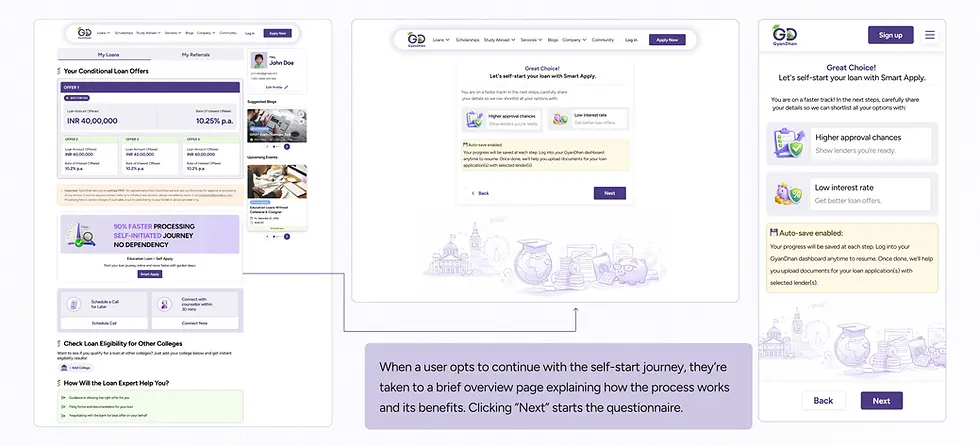
1- Reduced Visual Weight of Loan Offers
-
Removed dependency on ELC calls for collecting user details
-
Asked users to share all required information upfront via the Auto Journey form
2- Introduced a Clear Self-Initiation CTA
-
Added a prominent “Self-Initiated Journey” / “Smart Apply” CTA
-
Positioned directly below the loan offers
3- Simplified Decision Paths
-
Call scheduling moved to a secondary action
-
Primary emphasis on starting the journey

Form Design
While designing the form, we organized the information in a logical sequence to ensure a smooth user flow. Basic details like name and contact information are grouped under the Personal Information section, while collateral details are placed under the Collateral section. Below is the breakdown of the information:
This is the link of questioner prepared by me and PM.

1- Form Structure
-
Progress bar at the top shows each step in the loan application process.
-
Sub-sections break the form into manageable parts for easier navigation.
-
When User opt for Auto Journey we ask information in buckets. Students Detail, Collateral Details, Co-Applicant Details and Output.
-
Clearly labeled input fields collect required details like date of birth and parents’ names.
-
Prominent "Back" and "Next" buttons guide users through the form

1- Auto Journey Output
-
View and compare multiple lenders side by side (interest rate, processing time, collateral requirement, repayment terms, etc.).
-
Select one or more preferred lenders (up to a defined limit).
-
Modify their selection later if needed.
How Users respond to Version 1


What Next ( Version 2)
Automate Documnet Upload and Verification
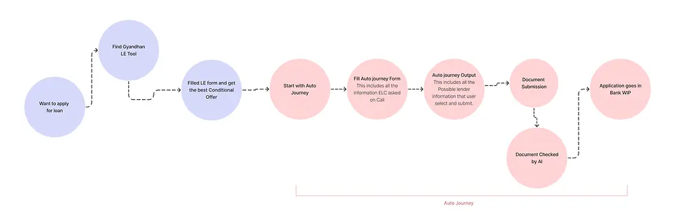

To increase Auto Journey adoption, I introduced a prominent top-of-page banner that nudges users to take the next step immediately after viewing their loan offer.

After selection of lenders users are redirected to document upload screen.

Steps with System Indicator
1. Select the required document type and upload the file.
2. The uploaded document is being reviewed (AI or manual verification).
3. The document has been successfully verified.
4. The system could not clearly identify or classify the document.
5. The document was rejected due to quality or clarity issues.

Here if Document is not recognized by AI , but it is good in quality it gives an option to user to self identify.
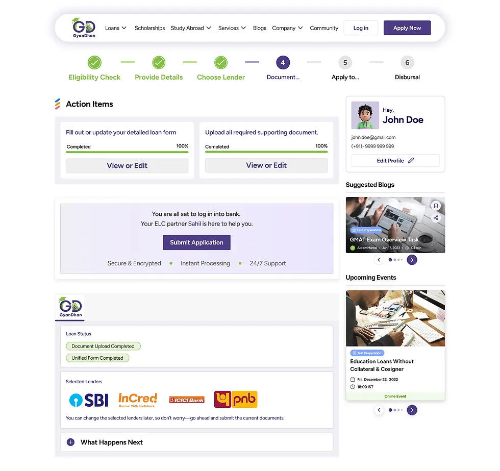
After Document Submission User can submit the application, and next ELC will take action on the application.

Trade Off- Speed vs Accuracy
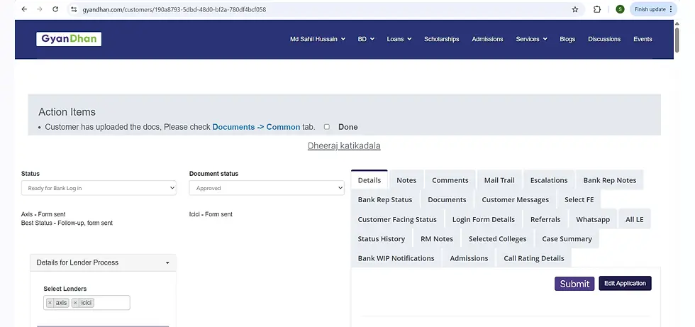
Status of Application on ELC Dashboard
1. Status of application and Document status get updated on ELC's Dashboard and he/she can submit this application. Once he submit this application it
logged in into bank acount.
Rework on Document Upload Screens

We chose Option 2 (Small Thumbnail) because users get a quick glance of the document without having to tap the eye icon. If they want to see the full image, they can still tap the eye icon to open the full preview.
View Full Prototype Here
